The Elements of a Successful Author Website: A Guide to Design
Designing a website and deciding how it will look is a part of web design that I really enjoy doing. You have so many possibilities to be creative and really put your stamp on your website. It’s easy to get caught up in all the minute decisions like typography or background colours while missing the bigger picture of what your website is being used for.
So here is the process I use when I design a website to make sure I can incorporate what I need while also allowing for creative touches that I want.
Research
This can be quite an interesting experience as an author. It’s easy to just focus on you and your brand but it is also important to see what the (and I hate this word) “competition” are doing.
You want to find out:
- Is there a standard layout of a website in your genre? Non-Fiction writers might post their latest articles on their home page. Sc-fi writers who write in series may only include their latest series or book on the home page and then have the rest relegated to a dedicated Book page.
- Are there recognisable colours for your genre? Black and red tend to be associated with crime writers. Pastel colours are more in keeping with romance authors. These are pretty easy tells for a reader to work out the type of author you are. While it can be good to try to standout , deviating from the expected norms can confuse readers. Readers do judge a book by its cover and your website will not be the exception.
- What sort of content is used on a website? Is there a huge About Me page or is it just a few sentences? A non-fiction author who writes about healthy eating will be expected to show their accomplishments in order to prove they can be trusted as an expert. While readers like to hear about authors, they aren’t going to want to read your entire life story. There may be the odd exception. If you were a school dinner lady who, after solving a murder on the school premises, becomes a crime writer, then readers probably wouldn’t mind reading about that as it’s relevant to your books.
- How is the site organised? Are books linked by series or genre? Is there a blog? Do they have a newsletter sign up sheet on the home page or is it buried in the About Me page? Viewing a few websites in your genre will give you a good idea of how to lay out your website. Some readers will expect a freebie/ reader magnet pretty early on in their viewing experience so study other authors websites to see what the convention is.
- What sort of images are used on the site? In this area, convention is once again king. If you write dark romance, then a picture of a pair of handcuffs in the header image will probably be okay. The same could also be true of a crime writer. Using images that appear overly sexual is best avoided. The last thing you want is to be flagged up as having a site that contains “Adult Material”.
This list isn’t exhaustive but merely a jumping off point. I find having a notebook and pen with me while I do my research allows for me to catch my thoughts and the similarities between author websites in my genre.
Wire Framing
By now, you should have a nice list of conventions for your website. It’s now time to do the planning or wire framing of your website.
How your wire frame will look will depend on your platform and if you intend to use plugins for design features.
I use Elementor Pro, which means I can be quite flexible with my design, as it’s a ‘drag and drop’ system. Check the restrictions or limitations of your platform before starting to wire frame or you’ll have to re-do it.
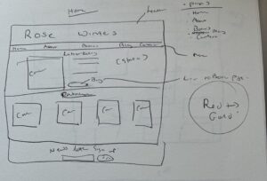
A wire frame is essentially a plan. I draw mine first on a piece of paper and then translate that design to Canva. At this stage, you can just add boxes with the word ‘text’ or ‘image’ rather than decide on the exact text or images . It’s a bit like a floor plan for a house. It allows you to see where you will place your menu, header and content. Don’t worry if you don’t stick to this plan exactly as it is simply a guide. I have designed a few sites that have been changed from the original wire frame plan.
I would start by drawing each page as a large rectangle. Then start adding the things that will stay the same no matter what page it is. Elements like menus, headers and social media icons. From there, start adding the content.
This doesn’t have to be done in one go. You can stop and start as often as you like. It is best to spend some time on this part, as it is your plan. Even those who like to write their books via the pantsing method will normally have a vague plan. Trust me, it will save you so much time having a rough plan.

Colour and Typography Choices
As you’ve seen from your research, readers will expect some conventions when it comes to colour and even typography choices. I’m not your boss, but I’d strongly urge you to take standards and consider them in your design process.
A historical writer might choose a red and white theme with script style typography for their headings. A wellness non-fiction write would most likely stick to natural colours like green and brown as use simple and easy-to-read typography for their website.
There are some excellent websites for colour choices:
For typography I would stick to easy-to-read combinations. You want different text styles for your heading, subheadings and normal text. Script type fonts can look quite nice for headings but would be a pain to read for any length of time so best avoided for the main text. Here are some helpful websites for pairings:
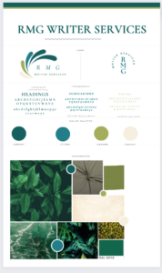
If you really want to help your future self (and who doesn’t?) then I would also do the extra step of making a style sheet. This will be your go to place for colours and typography choices. Some design plugins/platforms, such as Elementor, allow you to store these in their system. But even if that is an option having a style sheet can be handy for other areas of your business like social media platforms. This way, you can keep everything consistent.

Images
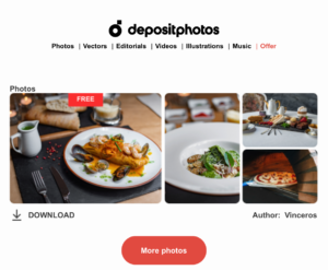
Most of your images will be of your own books, but you may want to add more images for promotional reasons. BookBrush and Canva are both excellent options if you’d like to make professional looking mock-ups of your work. I’ve made headers in Canva which I can then import into a website. Canva allows you to keep the colour conventions you want so that can make the design process pretty quick.For heaven’s sake, do not just take images from Google. You don’t own them. Stock Photos and Deposit Photos offer reasonably priced images. Deposit Photo’s offers free images when you sign up to their newsletter. They can sometimes be a bit niche, but they are free and you may get lucky one day.
Also, make sure that images are clear and not pixelated. It looks very unprofessional to have images like that. Some images just will never look good no matter how many times you resize them, so have a good stock of promotional images that you can rotate.

So there you have it. By the end of this post, you will have a few things to think about in regards to planning and designing your website.
I hope this post has helped you with designing your author website. If you have questions, just drop me a message.